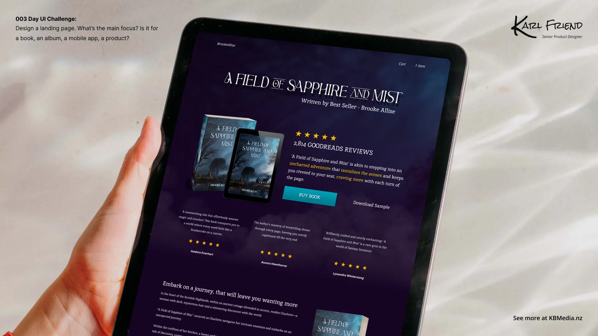
A landing page has seconds to answer ‘what is this and why should I care’. I worked on a headline that leads with value, a supporting visual that shows rather than tells, and a single, confident call to action.
The craft was in restraint — resisting the urge to say everything, and instead sequencing the story so each section earns the one below it.
A landing page isn’t a brochure. It’s a series of promises, each one buying the next scroll.
This was day 3 of a 14-day daily UI challenge. You can browse every screen in the full challenge gallery →
← Back to all posts.webp)

