
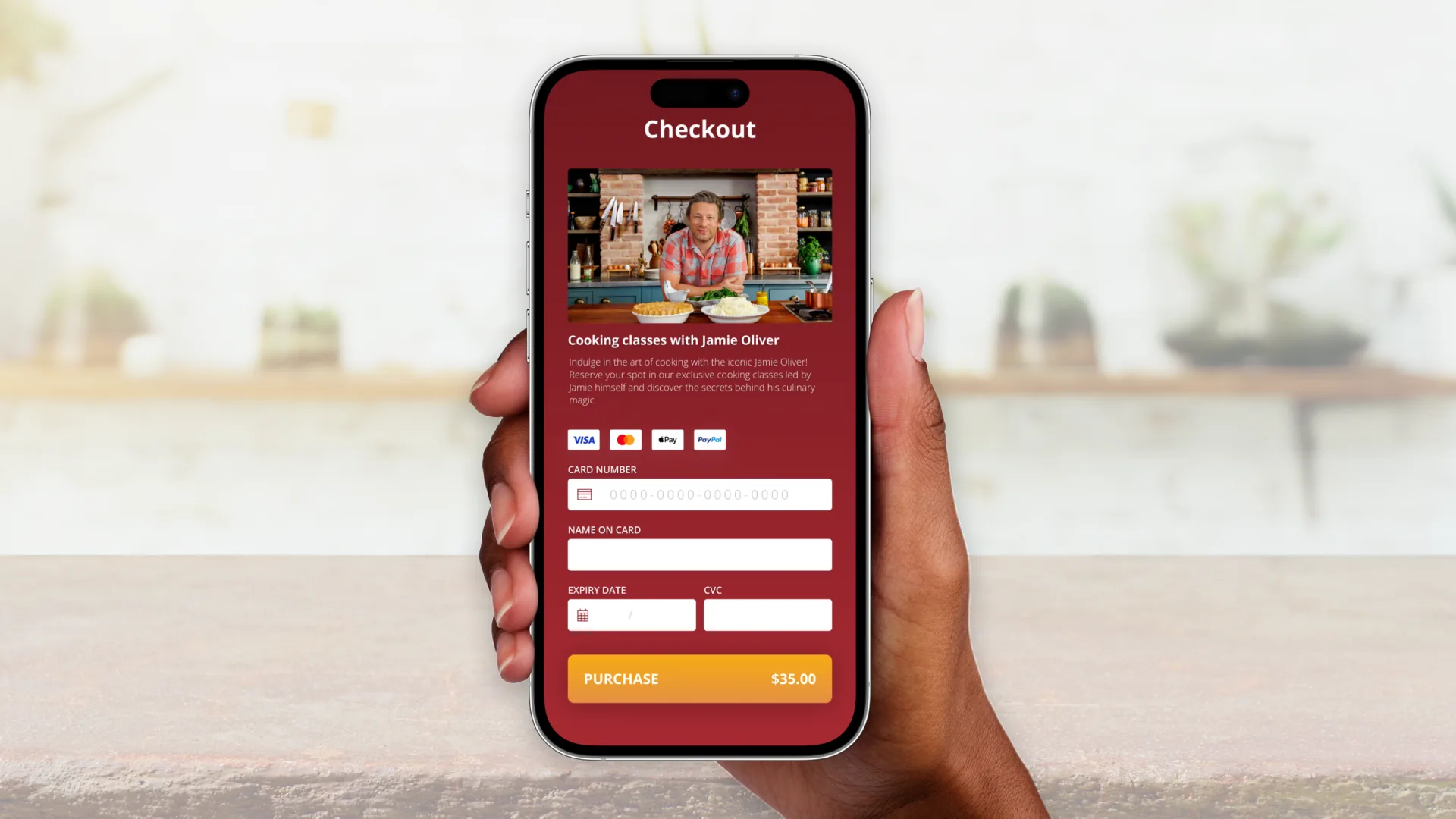
Checkout is where clarity and trust have to peak at the same moment. I concentrated on an unambiguous order summary, obvious editability, and removing every element that didn’t help someone feel confident pressing ‘pay’.
The lesson was reassurance: totals that add up visibly, clear affordances for changing details, and no surprises. Friction here isn’t a UI problem, it’s a revenue problem.
In checkout, every moment of doubt is a chance to abandon — design out the doubt.
This was day 2 of a 14-day daily UI challenge. You can browse every screen in the full challenge gallery →
← Back to all posts.webp)

