
Product design case study · Friendly Manager
Website Builder
Replacing a 10-year-old platform with a flexible website builder built for sports clubs.
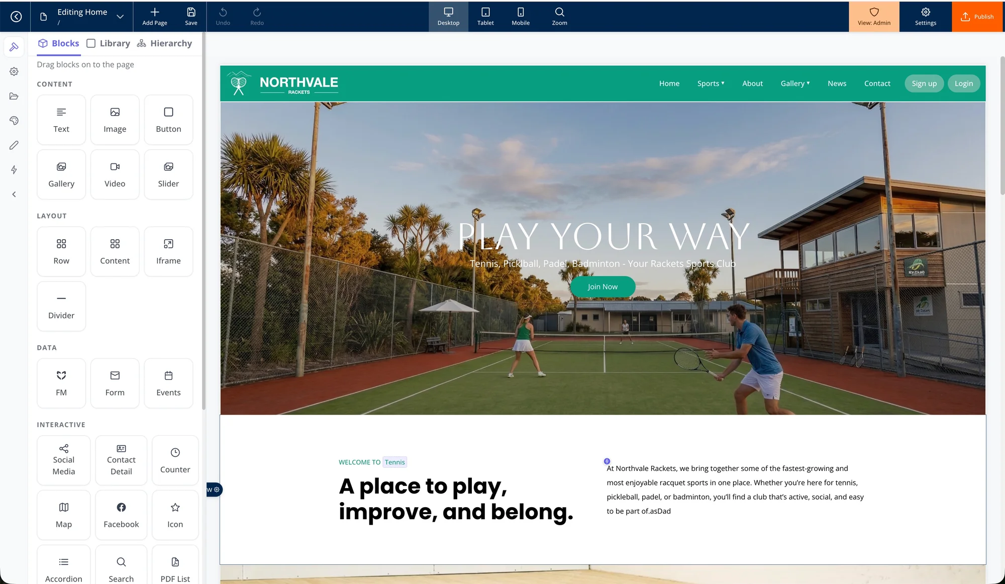
The outcome
A modern, integrated website platform that gave beginners a safe starting point, advanced users deeper control, and Friendly Manager a new recurring and service-based revenue stream.
01 · The problem
A simple product that had become too restrictive
Friendly Manager’s original website platform was more than 10 years old. It had been designed as a paint-by-numbers editor: customers could replace an image, edit text and save the page. They could not move sections, reorder content, create layouts or control responsive behaviour.
That simplicity once made the product approachable. Over time, it became the main limitation. Website expectations changed, clubs wanted more control, and support requests repeatedly exposed the same gap between the platform and modern website builders.
Customer problem
Clubs could not adapt their websites as their needs changed.
Business problem
The old product was increasingly difficult to sell, support and grow.
Product opportunity
Build a club-specific platform rather than another generic website tool.
Strategic advantage
Connect the website directly to Friendly Manager data and workflows.
My role
I led the project from discovery through design, development, beta testing and launch. I was responsible for the product direction, final UX decisions, Figma work, specifications, build reviews, test coordination, pricing structure and roadmap.
- Reviewed more than a decade of customer requests and support tickets
- Interviewed club administrators across New Zealand and Australia
- Benchmarked WordPress, Elementor, Wix, Weebly, Joomla and Webflow
- Designed wireframes, prototypes, responsive controls and high-fidelity UI
- Worked directly with a primary developer and backend developer
- Managed testing and bugs through ClickUp
- Helped define tiered plans and the custom website service
02 · Product strategy
Designing for two extremes
Our customers ranged from people who had barely used a computer to people with web and UX experience. A single interface would either overwhelm beginners or frustrate experienced users. I designed a progressive-access model that matched control to confidence.
Guided editing
Guided editing inside a responsive theme. Users could update text and images without needing to understand layout systems.
More freedom
More freedom to resize, reorder and move content while staying within a structured system.
Full access
Full access to rows, columns, blocks, responsive overrides and custom page creation.
The differentiator: deep platform integration
The most valuable customer need was not another visual editor. It was eliminating duplicate work between Friendly Manager and the public website.
A club administrator could create an event in Friendly Manager, click a button, and automatically generate the website page, rows, blocks and event content. The same platform could surface teams, registrations, fixtures, results, news, sponsors and calendars.
The website builder became an extension of the club management platform, not a separate tool.
03 · The design system
Consistency by default, flexibility when needed
Theme management was the most complex design problem. Customers needed the confidence that their site would look consistent, while advanced users still needed room to customise.
I introduced global controls for logos, colours, fonts and shared styles. Changing a global property updated the entire website. Reusable blocks allowed commonly repeated sections to stay consistent across pages, while local overrides preserved flexibility.
Global properties
Brand-level settings flowed through the whole site.
Reusable blocks
Sponsors, calls to action and shared information could be created once and reused.
Responsive by default
Themes, rows and blocks adapted automatically across devices.
Advanced overrides
Higher plans could adjust properties independently for desktop, tablet and mobile.
Progressive controls
Simple options appeared first, with advanced settings available when required.
A key usability insight
We originally assumed customers would want to land on a list of pages. Testing showed they did not think in terms of information architecture. They wanted to see their website first, then edit the thing in front of them.
We changed the landing experience from a management view to a visual website view.
04 · Testing and delivery
An iterative process with real users
We tested with complete beginners, experienced website users, internal staff with mixed digital confidence, a dedicated testing team and customer beta groups.
AI-assisted design and QA
I began with wireframes, prototypes and high-fidelity designs in Figma. Once the visual language and interaction patterns were established, I trained Claude to help extend the remaining components and speed up repetitive design work.
I also created a reusable Claude skill for template quality assurance. It checked spacing, margins, column gaps and responsive behaviour across desktop, tablet and mobile. Final quality was still validated by real people using real phones and tablets.
This was not AI replacing design judgment. It was AI scaling a design direction and reducing repetitive QA work.
05 · Outcomes
A product that changed the commercial model
The new builder gave customers a path from a free, guided website through to a fully customised product and professional build service.
- Around 10 customers began using the builder in its first week with minimal launch marketing.
- Customers could naturally upgrade as their confidence and needs grew.
- Friendly Manager could now deliver complete custom website projects.
- The new service created recurring revenue, project revenue and additional work for the team.
- Clubs gained more independence and could manage their own content without relying on developers.
Customer example: Tauranga City Football
Tauranga City Football
Seasonal club website
Tauranga City Football moved from an outdated site to a modern, seasonal website built on the new platform. I redesigned the homepage and navigation, improved the user journey, created AI-assisted imagery and produced video content.
Scheduled content blocks allowed the club to choose what appeared at different points in the season, from registrations and fixtures to finals and prizegiving. The club could manage the site itself once it was live.
06 · Reflection
What I learned
The project used a larger, big-bang release than I would choose today. It delivered a capable product, but it increased complexity and meant parts of the UI needed to be simplified later.
If I started again, I would:
- Use AI from the beginning to build working front-end concepts earlier
- Release a smaller MVP to customers sooner
- Bring development closer to design from the start
- Use less static Figma work and more code-led prototyping
- Test the complete publishing and domain flow earlier
- Build each next stage from observed customer behaviour
What I am most proud of
I took a product the company had needed to replace for more than a decade and led it from customer insight through to a functioning commercial platform.
The work connected customer research, product strategy, interaction design, responsive systems, theme architecture, pricing, integrations, delivery, testing and AI-assisted workflows. It also required me to keep the product moving through developer changes, implementation compromises and a domain infrastructure issue discovered during beta.
The result was not only a better interface. It was a new platform, a new service offering and a stronger foundation for the business.
.webp)

